Case Study | Enterprise UX | Energy Sector | Internal Tool
Cockatiel: Enterprise Project Management and Evaluation Tool
I joined as the sole UX designer on a project to redesign a broken internal approval process that was costing the company months — sometimes years — on requests that should have taken weeks. The challenge wasn't just the interface. It was untangling years of organizational complexity and getting five to seven departments to agree on a new way of working.
ROLE
Lead UX Designer (sole designer)
USERS
50–100 internal (submitters, reviewers, admins)
DURATION
6–12 months
Scope
Research, Strategy, Workflow Design, Design System, Handoff
‘Turbo-Tax-like’ project evaluation wizard featured on desktop.
Weeks
Standard requests reduced from months to weeks
~20%
Improvement in approval efficiency post-launch
5-7
Departments unified under one transparent workflow
Scroll to Project Screens
…or continue reading the case study below
Context
A process so slow it was blocking the business from moving forward.
At Constellation, requesting and approving a new internal solution could take anywhere from six months to a year — sometimes longer. Projects that supported business operations and growth were stalled not because of technical complexity, but because the process itself was broken. Requests disappeared into approval pipelines with no visibility, no clear ownership, and no way to know what was holding things up.
The company launched the Solution Enablement Process initiative to fix this. I came on at the very beginning as the sole UX designer, responsible for designing the full product experience — from how requests were created to how they were reviewed, communicated, and approved across departments.
The problem wasn't a bad tool. It was a broken process that had never been questioned — and a new tool built around that same broken process wouldn't fix anything.
That realization shaped the entire design strategy from day one:
"How do we build a platform that doesn't just digitize the existing process — but restructures it so that requests move faster, responsibilities are clear, and no one is left wondering what happens next?"
Discovery & Research
The legacy tool wasn't the problem. The process it was built around was.
A UX Researcher led the formal discovery phase. I collaborated closely throughout, using findings to directly inform design decisions. Research methods included stakeholder workshops, heuristic evaluations of the legacy tool, user interviews, and cross-department review sessions.
Three findings defined the entire product strategy:
Finding 01
The process itself was the main problem
The legacy tool had been built around outdated governance structures with unnecessary steps baked in. Many actions in the workflow existed simply because they always had — not because they served a purpose. Fixing the UI without fixing the process would have changed nothing.
Finding 02
No one knew who was responsible for what
Departments involved in approvals had different expectations about what information was required before they could act. Without clear ownership, requests stalled indefinitely — and no one knew who to go to for answers.
Finding 03
Visibility was the single biggest unmet need
Users had no way to know who was reviewing their request, what needed to happen next, or why something was delayed. That lack of transparency wasn't just frustrating — it was the primary reason requests stalled and stayed stalled.
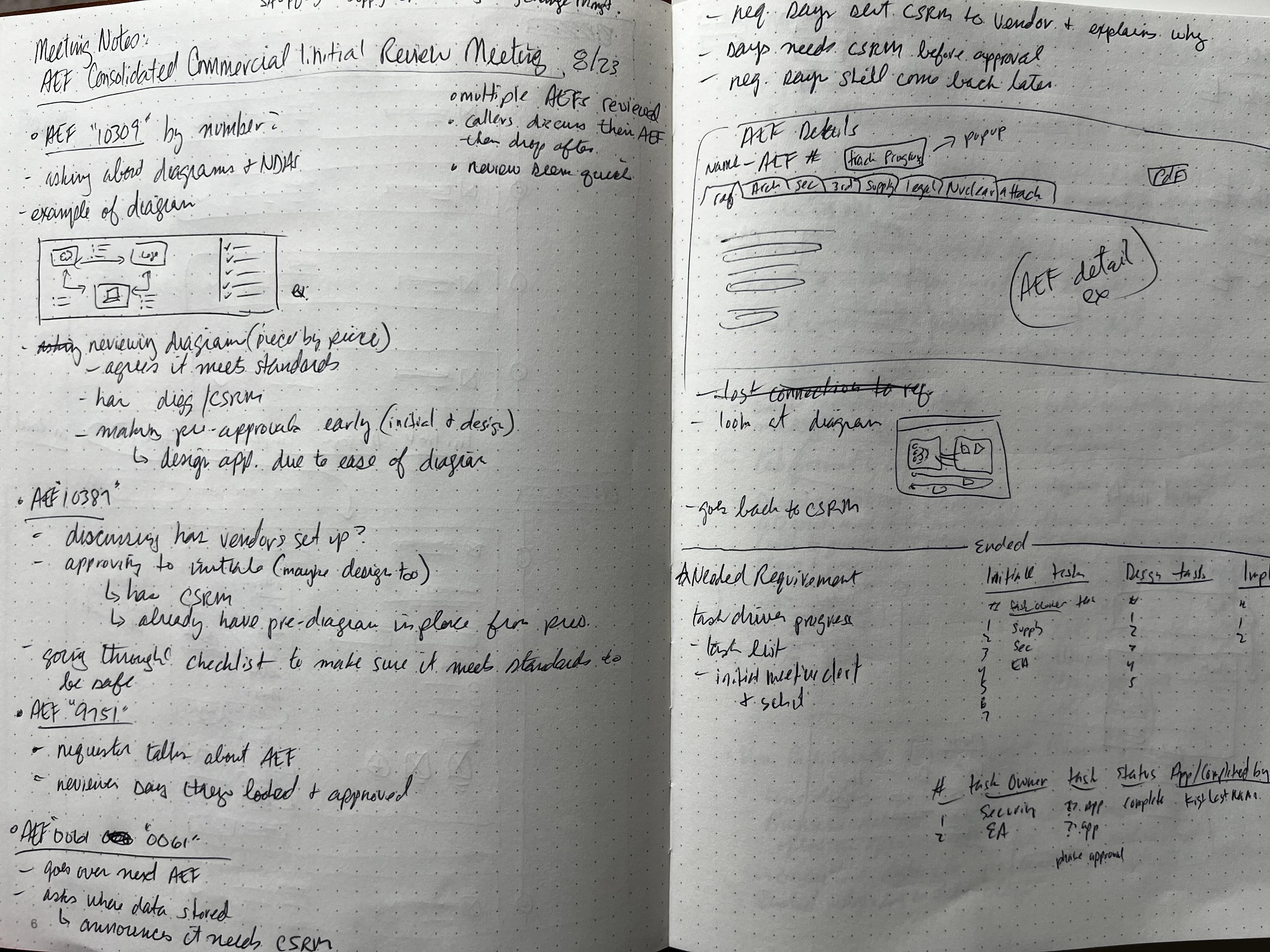
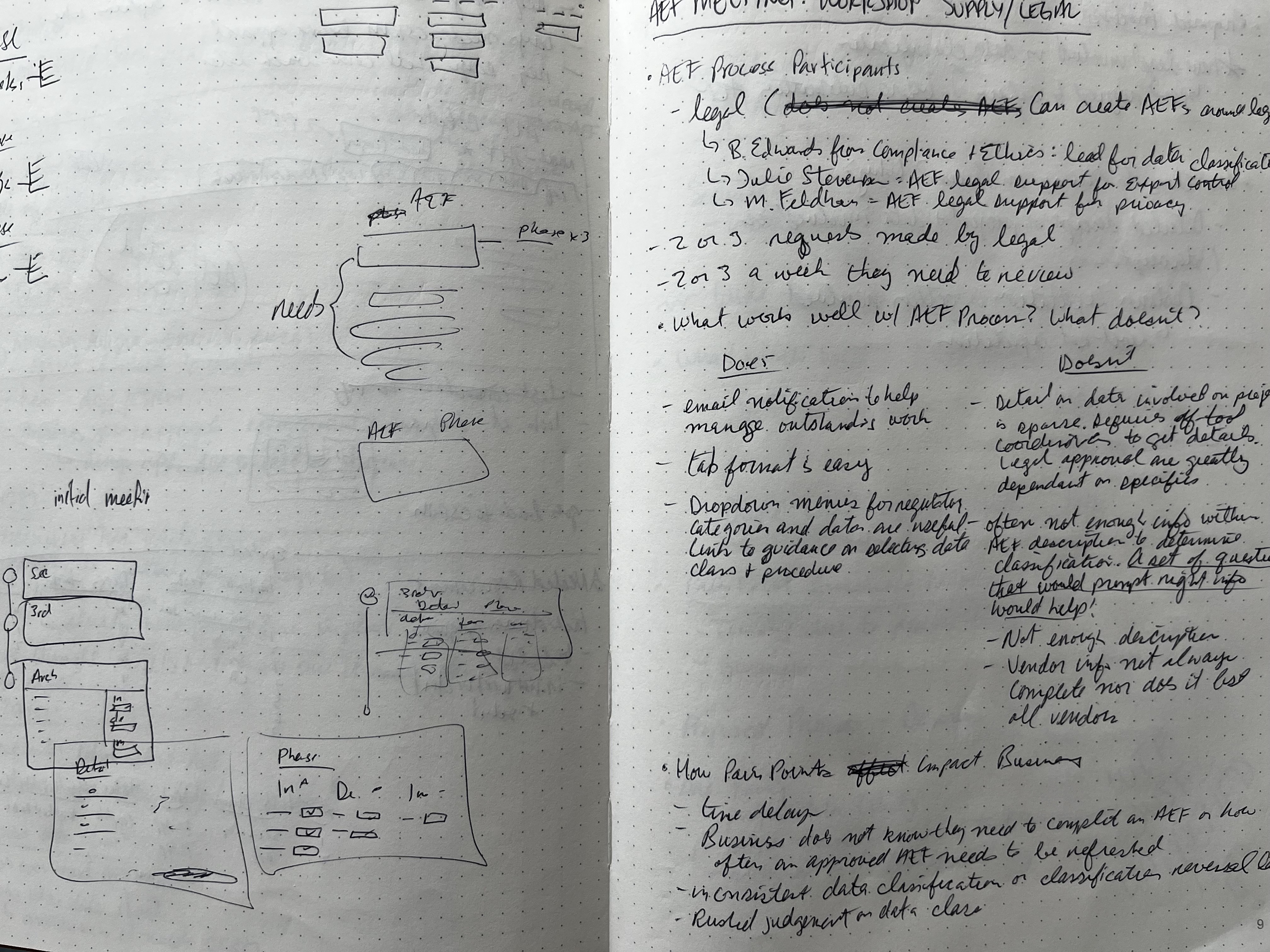
Images of notes, sketches, and requirements
Design Decisions
Two decisions that defined how the platform actually worked.
This project required constant prioritization — complex workflows, multiple departments, two product owners with competing expectations. These are the two design decisions that had the highest impact on whether the platform would succeed.
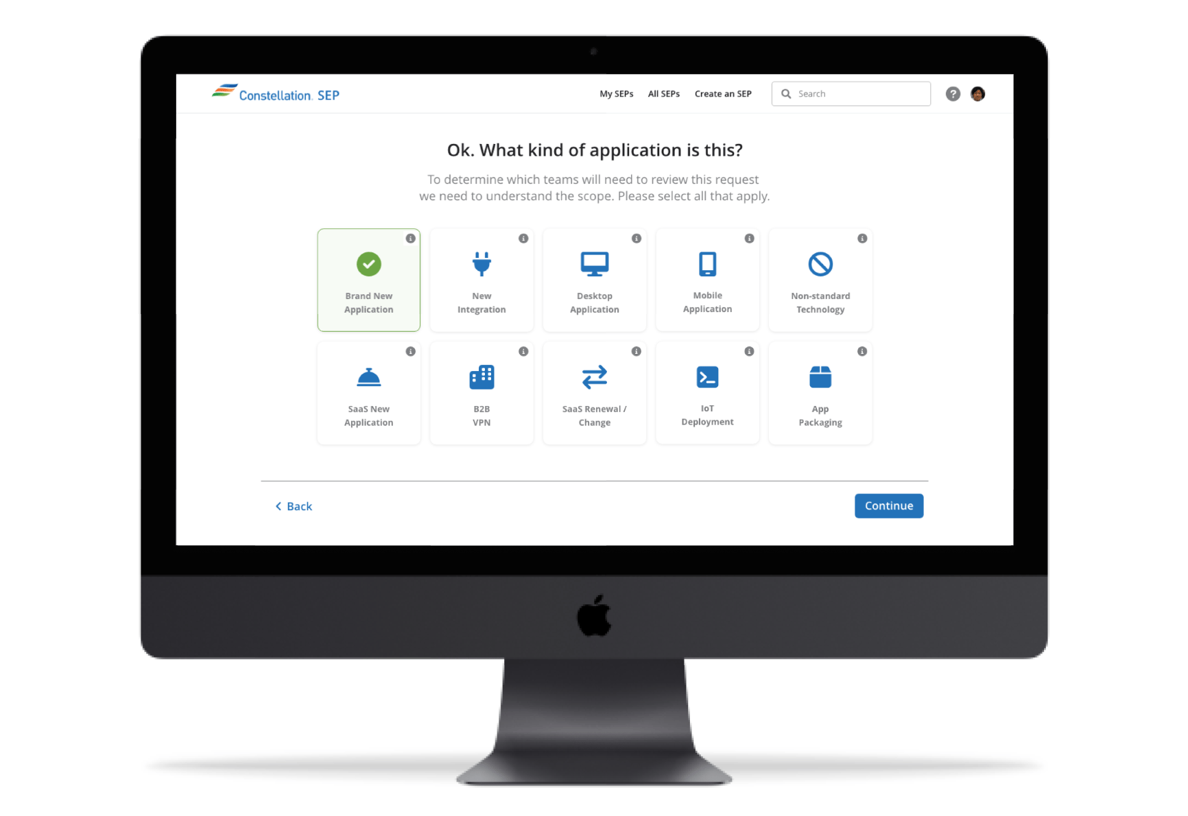
Decision 01 · Request Creation
Long, confusing forms weren't a formatting problem. They were a cognitive load problem.
The legacy experience presented users with dense, unstructured forms that were difficult to complete accurately. Errors and incomplete submissions were common — not because users were careless, but because the form gave them no way to understand what was actually required at each stage.
I redesigned request creation as a guided wizard — breaking the process into progressive steps that let users focus on one task at a time. Each step surfaced only what was needed at that moment, with clear labels, contextual help, and forward momentum built into the flow.
The client understood the value of this approach immediately — the wizard matched how they had already been thinking about simplifying intake. What made it successful wasn't just the stepped format, but the careful sequencing of information based on what users actually needed to know and when.
Outcome: reduced cognitive load, improved completion accuracy, fewer incomplete submissions
Decision 02 · Stakeholder Alignment
Two product owners, five to seven departments, and no shared definition of "done."
Working with two product owners from different departments created significant friction throughout the project. They disagreed on how things should look, how workflows should function, and what process steps were necessary. Left unresolved, those disagreements would surface as constant design revisions, drawn-out meetings with no outcomes, and a product that satisfied neither party.
Rather than designing toward one stakeholder's vision and hoping the other would come around, I gave both options — presenting design directions that made trade-offs explicit and gave them something concrete to react to. When disagreements ran deeper than a design decision could resolve, I pushed for internal alignment sessions between the two owners before bringing it back to design.
That shift — from me mediating disagreements to them resolving them — changed the pace of the project. When stakeholders arrived at design reviews already aligned, the work moved forward instead of backward.
Outcome: fewer redundant revisions, faster design reviews, clearer direction from stakeholders
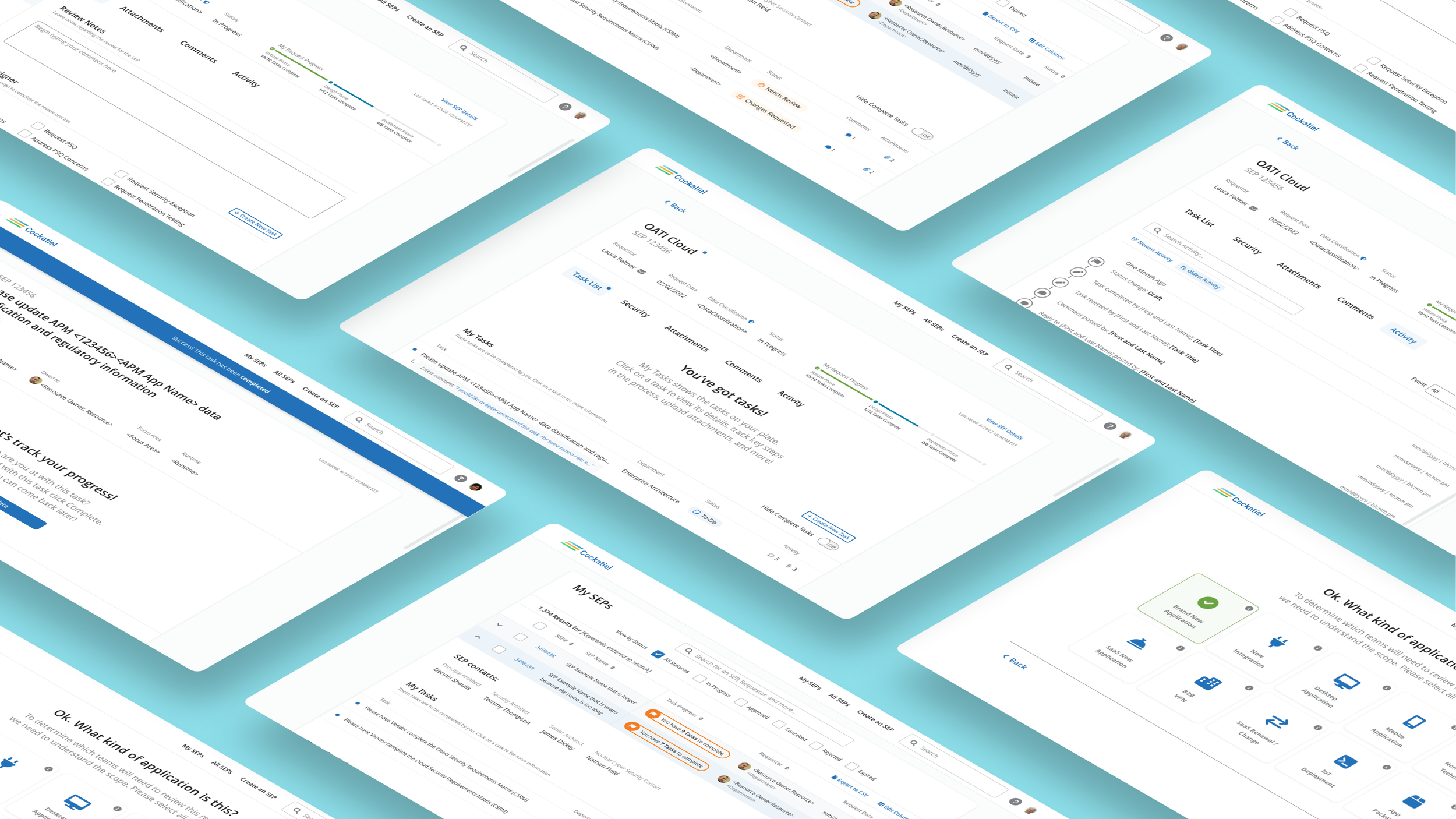
Workflow DesigN
Making the invisible visible — across every stage of a request.
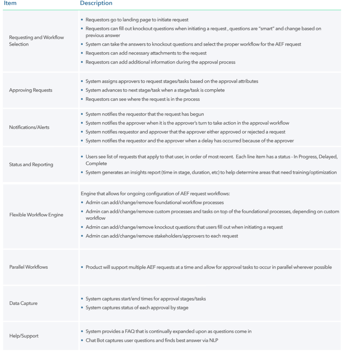
Transparency was the core design problem. Users needed to understand where their request was, who was responsible for what, and what needed to happen next — at any point in the lifecycle. I designed a request management system built around that need.
- Progress indicators showing the current phase of each request
- Separate task lists for "My Tasks" and "Others' Tasks" — making ownership unambiguous
- Status badges for quick visual scanning across multiple requests
- A dedicated activity log tracking every action taken on a request
Request-specific messaging — so questions, clarifications, and decisions stayed in context rather than fragmenting across email threads
One of the highest-impact iterations came from testing assumptions about departmental review steps. Early in the project, the team made assumptions about what certain departments needed before approving a request. Testing revealed those assumptions were wrong. Rather than guessing again, I pulled in a department SME directly — getting the correct requirements from the source and redesigning those flows accordingly. It was a reminder that in enterprise UX, the subject matter experts in the room are often more valuable than any design framework.
Design System & Execution
Built from scratch — because the legacy patterns weren't worth inheriting.
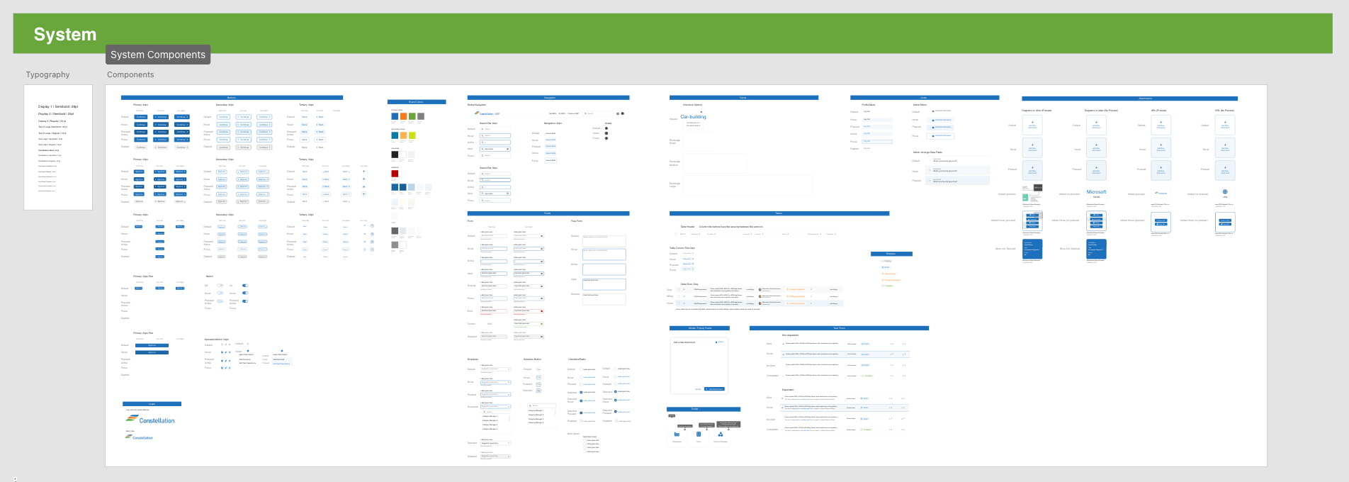
The existing product had inconsistent design patterns accumulated over years. Rather than trying to reconcile them, I built a new design system from the ground up — one that could support the platform's complexity while keeping the experience consistent and implementable.
- Typography and color standards established as the foundation
- Full component library — buttons, forms, badges, navigation, feedback patterns
- Layout and spacing guidelines for dense workflow screens
- System feedback and messaging patterns for status, errors, and confirmations
- Accessibility considerations documented throughout
Engineering documentation included to reduce implementation ambiguity
Handoff was completed in Adobe XD with detailed specs, documented workflows, and walkthrough sessions with engineers to review design intent directly. After implementation, I performed UXQA in development environments — signing off only when the final product matched what was designed.
Screenshot sections of design system and a handoff file
Outcomes
Faster approvals, clearer ownership, and a process people actually trusted.
The SEP platform launched internally and changed how the organization moved requests through the system. The improvement wasn't uniform — not all requests follow the same review path — but the direction was consistent across the board. Standard requests that previously took months now took weeks. Complex requests that once stretched into years were completed in months. Faster timelines weren't the only change. Users were completing tasks more promptly because they finally had visibility into what was required of them and when.
Timelines cut significantly
Standard requests reduced from months to weeks; complex ones from years to months
~20% approval efficiency gain
Measurable improvement in how quickly requests moved through the review pipeline
Task completion improved
Users acted faster once they had clear visibility into what was required and who owned it
Cross-department clarity
5–7 departments now operating under a shared, transparent workflow for the first time
“This has really made the process so much quicker than it used to be.”
Internal stakeholders, Constellation
“The wizard is such a huge help in making request creations faster.”
End User, Constellation
“This is a great design and really gets to the point making our job much easier.”
FE Developer, Constellation
“This really takes a lot of guess-work away. Thanks.”
End User, Constellation
“This is fantastic and just what we were looking for!”
Product Owner, Constellation
Reflection
What I'd do differently.
I’d change
- Push for stakeholder alignment sessions earlier — waiting until disagreements surfaced in design reviews cost time that could have been avoided
- Pull in department SMEs sooner during discovery — assumptions about review requirements led to rework that a single early conversation could have prevented
- Establish clearer design decision documentation from the start — with two product owners, having a written record of what was decided and why would have reduced revisiting resolved discussions
What I learned
- In enterprise UX, the process is often the product — you can't design a good tool around a broken workflow
- Stakeholder misalignment is a design problem, not just a project management problem — and it's one designers can actively help solve
- The right SME in the room at the right time is worth more than any amount of assumption-driven iteration
Selected Screens
Desktop
Scroll to Case Study
Case Study | Enterprise UX | Energy Sector | Internal Tool
Cockatiel: Enterprise Project Management and Evaluation Tool
I joined as the sole UX designer on a project to redesign a broken internal approval process that was costing the company months — sometimes years — on requests that should have taken weeks. The challenge wasn't just the interface. It was untangling years of organizational complexity and getting five to seven departments to agree on a new way of working.
ROLE
Lead UX Designer (sole designer)
USERS
50–100 internal (submitters, reviewers, admins)
DURATION
3 6–12 months
Scope
Research, Strategy, Workflow Design, Design System, Handoff
‘Turbo-Tax-like’ project evaluation wizard featured on desktop.
Weeks
Standard requests reduced from months to weeks
~20%
Improvement in approval efficiency post-launch
5-7
Departments unified under one transparent workflow
Scroll to Project Screens
…or continue reading the case study below
Context
A process so slow it was blocking the business from moving forward.
At Constellation, requesting and approving a new internal solution could take anywhere from six months to a year — sometimes longer. Projects that supported business operations and growth were stalled not because of technical complexity, but because the process itself was broken. Requests disappeared into approval pipelines with no visibility, no clear ownership, and no way to know what was holding things up.
The company launched the Solution Enablement Process initiative to fix this. I came on at the very beginning as the sole UX designer, responsible for designing the full product experience — from how requests were created to how they were reviewed, communicated, and approved across departments.
The problem wasn't a bad tool. It was a broken process that had never been questioned — and a new tool built around that same broken process wouldn't fix anything.
That realization shaped the entire design strategy from day one:
"How do we build a platform that doesn't just digitize the existing process — but restructures it so that requests move faster, responsibilities are clear, and no one is left wondering what happens next?"
Discovery & Research
The legacy tool wasn't the problem. The process it was built around was.
A UX Researcher led the formal discovery phase. I collaborated closely throughout, using findings to directly inform design decisions. Research methods included stakeholder workshops, heuristic evaluations of the legacy tool, user interviews, and cross-department review sessions.
Three findings defined the entire product strategy:
Finding 01
The process itself was the main problem
The legacy tool had been built around outdated governance structures with unnecessary steps baked in. Many actions in the workflow existed simply because they always had — not because they served a purpose. Fixing the UI without fixing the process would have changed nothing.
Finding 02
No one knew who was responsible for what
Departments involved in approvals had different expectations about what information was required before they could act. Without clear ownership, requests stalled indefinitely — and no one knew who to go to for answers.
Finding 03
Visibility was the single biggest unmet need
Users had no way to know who was reviewing their request, what needed to happen next, or why something was delayed. That lack of transparency wasn't just frustrating — it was the primary reason requests stalled and stayed stalled.
Images of notes, sketches, and requirements
Design Decisions
Two decisions that defined how the platform actually worked.
This project required constant prioritization — complex workflows, multiple departments, two product owners with competing expectations. These are the two design decisions that had the highest impact on whether the platform would succeed.
Decision 01 · Request Creation
Long, confusing forms weren't a formatting problem. They were a cognitive load problem.
The legacy experience presented users with dense, unstructured forms that were difficult to complete accurately. Errors and incomplete submissions were common — not because users were careless, but because the form gave them no way to understand what was actually required at each stage.
I redesigned request creation as a guided wizard — breaking the process into progressive steps that let users focus on one task at a time. Each step surfaced only what was needed at that moment, with clear labels, contextual help, and forward momentum built into the flow.
The client understood the value of this approach immediately — the wizard matched how they had already been thinking about simplifying intake. What made it successful wasn't just the stepped format, but the careful sequencing of information based on what users actually needed to know and when.
Outcome: reduced cognitive load, improved completion accuracy, fewer incomplete submissions
Decision 02 · Stakeholder Alignment
Two product owners, five to seven departments, and no shared definition of "done."
Working with two product owners from different departments created significant friction throughout the project. They disagreed on how things should look, how workflows should function, and what process steps were necessary. Left unresolved, those disagreements would surface as constant design revisions, drawn-out meetings with no outcomes, and a product that satisfied neither party.
Rather than designing toward one stakeholder's vision and hoping the other would come around, I gave both options — presenting design directions that made trade-offs explicit and gave them something concrete to react to. When disagreements ran deeper than a design decision could resolve, I pushed for internal alignment sessions between the two owners before bringing it back to design.
That shift — from me mediating disagreements to them resolving them — changed the pace of the project. When stakeholders arrived at design reviews already aligned, the work moved forward instead of backward.
Outcome: fewer redundant revisions, faster design reviews, clearer direction from stakeholders
Workflow Design
Making the invisible visible — across every stage of a request.
Transparency was the core design problem. Users needed to understand where their request was, who was responsible for what, and what needed to happen next — at any point in the lifecycle. I designed a request management system built around that need.
- Progress indicators showing the current phase of each request
- Separate task lists for "My Tasks" and "Others' Tasks" — making ownership unambiguous
- Status badges for quick visual scanning across multiple requests
- A dedicated activity log tracking every action taken on a request
Request-specific messaging — so questions, clarifications, and decisions stayed in context rather than fragmenting across email threads
One of the highest-impact iterations came from testing assumptions about departmental review steps. Early in the project, the team made assumptions about what certain departments needed before approving a request. Testing revealed those assumptions were wrong. Rather than guessing again, I pulled in a department SME directly — getting the correct requirements from the source and redesigning those flows accordingly. It was a reminder that in enterprise UX, the subject matter experts in the room are often more valuable than any design framework.
Design System & Execution
Built from scratch — because the legacy patterns weren't worth inheriting.
The existing product had inconsistent design patterns accumulated over years. Rather than trying to reconcile them, I built a new design system from the ground up — one that could support the platform's complexity while keeping the experience consistent and implementable.
- Typography and color standards established as the foundation
- Full component library — buttons, forms, badges, navigation, feedback patterns
- Layout and spacing guidelines for dense workflow screens
- System feedback and messaging patterns for status, errors, and confirmations
- Accessibility considerations documented throughout
Engineering documentation included to reduce implementation ambiguity
Handoff was completed in Adobe XD with detailed specs, documented workflows, and walkthrough sessions with engineers to review design intent directly. After implementation, I performed UXQA in development environments — signing off only when the final product matched what was designed.
Screenshot sections of design system and a handoff file
Outcomes
Faster approvals, clearer ownership, and a process people actually trusted.
The SEP platform launched internally and changed how the organization moved requests through the system. The improvement wasn't uniform — not all requests follow the same review path — but the direction was consistent across the board. Standard requests that previously took months now took weeks. Complex requests that once stretched into years were completed in months. Faster timelines weren't the only change. Users were completing tasks more promptly because they finally had visibility into what was required of them and when.
Timelines cut significantly
Standard requests reduced from months to weeks; complex ones from years to months
~20% approval efficiency gain
Measurable improvement in how quickly requests moved through the review pipeline
Task completion improved
Users acted faster once they had clear visibility into what was required and who owned it
Cross-department clarity
5–7 departments now operating under a shared, transparent workflow for the first time
“This has really made the process so much quicker than it used to be.”
Internal stakeholders, Constellation
“The wizard is such a huge help in making request creations faster.”
End User, Constellation
“This is a great design and really gets to the point making our job much easier.”
FE Developer, Constellation
“This really takes a lot of guess-work away. Thanks.”
End User, Constellation
“This is fantastic and just what we were looking for!”
Product Owner, Constellation
Reflection
What I'd do differently.
I’d change
- Start with a denser layout — I overcorrected early toward simplicity when enterprise users actually want information density
- Lock the color palette and spacing system before it sprawled — foundational decisions made late are expensive
- Choose a more scalable icon system from day one, before it was deeply embePush for stakeholder alignment sessions earlier — waiting until disagreements surfaced in design reviews cost time that could have been avoided
- Pull in department SMEs sooner during discovery — assumptions about review requirements led to rework that a single early conversation could have prevented
- Establish clearer design decision documentation from the start — with two product owners, having a written record of what was decided and why would have reduced revisiting resolved discussionsdded
What I learned
- In enterprise UX, the process is often the product — you can't design a good tool around a broken workflow
- Stakeholder misalignment is a design problem, not just a project management problem — and it's one designers can actively help solve
- The right SME in the room at the right time is worth more than any amount of assumption-driven iteration
Selected Screens
Desktop
Scroll to Case Study
Case Study | Enterprise UX | Energy Sector | Internal Tool
Cockatiel: Enterprise Project Management and Evaluation Tool
I joined as the sole UX designer on a project to redesign a broken internal approval process that was costing the company months — sometimes years — on requests that should have taken weeks. The challenge wasn't just the interface. It was untangling years of organizational complexity and getting five to seven departments to agree on a new way of working.
ROLE
Lead UX Designer (sole designer)
USERS
50–100 internal (submitters, reviewers, admins)
DURATION
6–12 months
Scope
Research, Strategy, Workflow Design, Design System, Handoff
‘Turbo-Tax-like’ project evaluation wizard featured on desktop.
Weeks
Standard requests reduced from months to weeks
~20%
Improvement in approval efficiency post-launch
5-7
Departments unified under one transparent workflow
Scroll to Project Screens
…or continue reading the case study below
Context
A process so slow it was blocking the business from moving forward.
At Constellation, requesting and approving a new internal solution could take anywhere from six months to a year — sometimes longer. Projects that supported business operations and growth were stalled not because of technical complexity, but because the process itself was broken. Requests disappeared into approval pipelines with no visibility, no clear ownership, and no way to know what was holding things up.
The company launched the Solution Enablement Process initiative to fix this. I came on at the very beginning as the sole UX designer, responsible for designing the full product experience — from how requests were created to how they were reviewed, communicated, and approved across departments.
The problem wasn't a bad tool. It was a broken process that had never been questioned — and a new tool built around that same broken process wouldn't fix anything.
That realization shaped the entire design strategy from day one:
"How do we build a platform that doesn't just digitize the existing process — but restructures it so that requests move faster, responsibilities are clear, and no one is left wondering what happens next?"
Discovery & Research
The legacy tool wasn't the problem. The process it was built around was.
A UX Researcher led the formal discovery phase. I collaborated closely throughout, using findings to directly inform design decisions. Research methods included stakeholder workshops, heuristic evaluations of the legacy tool, user interviews, and cross-department review sessions.
Three findings defined the entire product strategy:
Finding 01
The process itself was the main problem
The legacy tool had been built around outdated governance structures with unnecessary steps baked in. Many actions in the workflow existed simply because they always had — not because they served a purpose. Fixing the UI without fixing the process would have changed nothing.
Finding 02
No one knew who was responsible for what
Departments involved in approvals had different expectations about what information was required before they could act. Without clear ownership, requests stalled indefinitely — and no one knew who to go to for answers.
Finding 03
Visibility was the single biggest unmet need
Users had no way to know who was reviewing their request, what needed to happen next, or why something was delayed. That lack of transparency wasn't just frustrating — it was the primary reason requests stalled and stayed stalled.
Images of notes, sketches, and requirements
Design Decisions
Two decisions that defined how the platform actually worked.
This project required constant prioritization — complex workflows, multiple departments, two product owners with competing expectations. These are the two design decisions that had the highest impact on whether the platform would succeed.
Decision 01 · Request Creation
Long, confusing forms weren't a formatting problem. They were a cognitive load problem.
The legacy experience presented users with dense, unstructured forms that were difficult to complete accurately. Errors and incomplete submissions were common — not because users were careless, but because the form gave them no way to understand what was actually required at each stage.
I redesigned request creation as a guided wizard — breaking the process into progressive steps that let users focus on one task at a time. Each step surfaced only what was needed at that moment, with clear labels, contextual help, and forward momentum built into the flow.
The client understood the value of this approach immediately — the wizard matched how they had already been thinking about simplifying intake. What made it successful wasn't just the stepped format, but the careful sequencing of information based on what users actually needed to know and when.
Outcome: reduced cognitive load, improved completion accuracy, fewer incomplete submissions
Decision 02 · Stakeholder Alignment
Two product owners, five to seven departments, and no shared definition of "done."
Working with two product owners from different departments created significant friction throughout the project. They disagreed on how things should look, how workflows should function, and what process steps were necessary. Left unresolved, those disagreements would surface as constant design revisions, drawn-out meetings with no outcomes, and a product that satisfied neither party.
Rather than designing toward one stakeholder's vision and hoping the other would come around, I gave both options — presenting design directions that made trade-offs explicit and gave them something concrete to react to. When disagreements ran deeper than a design decision could resolve, I pushed for internal alignment sessions between the two owners before bringing it back to design.
That shift — from me mediating disagreements to them resolving them — changed the pace of the project. When stakeholders arrived at design reviews already aligned, the work moved forward instead of backward.
Outcome: fewer redundant revisions, faster design reviews, clearer direction from stakeholders
Workflow Design
Making the invisible visible — across every stage of a request.
Transparency was the core design problem. Users needed to understand where their request was, who was responsible for what, and what needed to happen next — at any point in the lifecycle. I designed a request management system built around that need.
- Progress indicators showing the current phase of each request
- Separate task lists for "My Tasks" and "Others' Tasks" — making ownership unambiguous
- Status badges for quick visual scanning across multiple requests
- A dedicated activity log tracking every action taken on a request
Request-specific messaging — so questions, clarifications, and decisions stayed in context rather than fragmenting across email threads
One of the highest-impact iterations came from testing assumptions about departmental review steps. Early in the project, the team made assumptions about what certain departments needed before approving a request. Testing revealed those assumptions were wrong. Rather than guessing again, I pulled in a department SME directly — getting the correct requirements from the source and redesigning those flows accordingly. It was a reminder that in enterprise UX, the subject matter experts in the room are often more valuable than any design framework.
Design System & Execution
Built from scratch — because the legacy patterns weren't worth inheriting.
The existing product had inconsistent design patterns accumulated over years. Rather than trying to reconcile them, I built a new design system from the ground up — one that could support the platform's complexity while keeping the experience consistent and implementable.
- Typography and color standards established as the foundation
- Full component library — buttons, forms, badges, navigation, feedback patterns
- Layout and spacing guidelines for dense workflow screens
- System feedback and messaging patterns for status, errors, and confirmations
- Accessibility considerations documented throughout
Engineering documentation included to reduce implementation ambiguity
Handoff was completed in Adobe XD with detailed specs, documented workflows, and walkthrough sessions with engineers to review design intent directly. After implementation, I performed UXQA in development environments — signing off only when the final product matched what was designed.
Screenshot sections of design system and a handoff file
Outcomes
Faster approvals, clearer ownership, and a process people actually trusted.
The SEP platform launched internally and changed how the organization moved requests through the system. The improvement wasn't uniform — not all requests follow the same review path — but the direction was consistent across the board. Standard requests that previously took months now took weeks. Complex requests that once stretched into years were completed in months. Faster timelines weren't the only change. Users were completing tasks more promptly because they finally had visibility into what was required of them and when.
Timelines cut significantly
Standard requests reduced from months to weeks; complex ones from years to months
~20% approval efficiency gain
Measurable improvement in how quickly requests moved through the review pipeline
Task completion improved
Users acted faster once they had clear visibility into what was required and who owned it
Cross-department clarity
5–7 departments now operating under a shared, transparent workflow for the first time
“This has really made the process so much quicker than it used to be.”
Internal stakeholders, Constellation
“The wizard is such a huge help in making request creations faster.”
End User, Constellation
“This is a great design and really gets to the point making our job much easier.”
FE Developer, Constellation
“This really takes a lot of guess-work away. Thanks.”
End User, Constellation
“This is fantastic and just what we were looking for!”
Product Owner, Constellation
Reflection
What I'd do differently.
I’d change
- Push for stakeholder alignment sessions earlier — waiting until disagreements surfaced in design reviews cost time that could have been avoided
- Pull in department SMEs sooner during discovery — assumptions about review requirements led to rework that a single early conversation could have prevented
- Establish clearer design decision documentation from the start — with two product owners, having a written record of what was decided and why would have reduced revisiting resolved discussions
What I learned
- In enterprise UX, the process is often the product — you can't design a good tool around a broken workflow
- Stakeholder misalignment is a design problem, not just a project management problem — and it's one designers can actively help solve
- The right SME in the room at the right time is worth more than any amount of assumption-driven iteration
Selected Screens
Desktop
Scroll to Case Study