Case Study | Enterprise UX | Energy Sector | Internal Tool
Falcon: Enterprise Drilling Platform
I was brought in as the first — and only — UX designer on a 3-year project to rebuild a mission-critical internal platform from the ground up. What started as a request to "make it responsive" became a full-scale redesign used daily by engineers, field teams, and executives to make real-time operational decisions.
ROLE
Lead UX Designer (sole designer)
USERS
50–100 daily (engineers, field teams, executives)
DURATION
3 years
Scope
Research, Strategy, Design, Design System, Handoff, UXQA
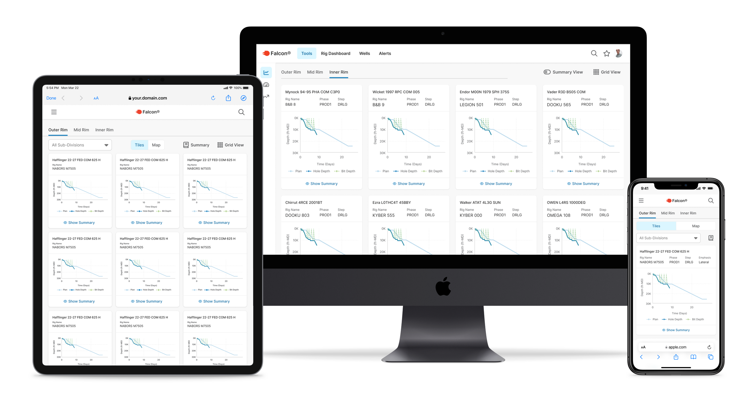
Real-time drilling life screen for currently active wells featured on various devices
45 min
Daily morning meetings, down from 1.5 hours
5 → 1
Separate tools consolidated into one platform
~15%
Increase in user adoption
Scroll to Project Screens
…or continue reading the case study below
Context
The brief was to make it responsive. The real problem was much bigger.
Devon Energy's internal drilling platform had been built by engineers, for engineers. It was functionally powerful — but usability had never been part of the equation. When I joined, drilling teams were bouncing between five separate tools to get through a single morning. Executives were sitting through 90-minute meetings just to review data that should have been immediately visible. The interface added cognitive load to moments that couldn't afford it.
The ask was "make it responsive." What I found was a system creating friction at every high-stakes moment — in the field, in the meeting room, and everywhere in between.
Before writing a single wireframe, I reframed the problem:
"How do we modernize and consolidate these tools while preserving what users know, improving clarity under pressure, and making critical data immediately visible across every device and environment where this work actually happens?"
Example of project’s previous state
Discovery & Research
I knew nothing about drilling. I had to learn fast and figure out what actually mattered.
Enterprise research is rarely textbook. I had limited access, users with no spare time, and a domain I was starting from zero in. I worked with what I had.
- Stakeholder and user interviews — drilling engineers, field staff, product owners
- Workshops to map mental models and surface hidden workflow dependencies
- Legacy tool audits — understanding what users were accustomed to before designing what came next
- Direct knowledge transfer from a drilling engineer embedded on the team
- On-site observation when access allowed
Three findings shaped everything that followed:
Finding 01
Legacy behavior was a feature, not a bug
Years of muscle memory were baked into old tools. Any redesign that ignored that would fail in adoption regardless of how polished it looked. The solution had to balance modernization with familiarity.
Finding 02
Visual clarity was a usability requirement, not polish
Many users were older with varying visual needs. Contrast, hierarchy, and typography weren't aesthetic choices — they were functional requirements for people scanning high-stakes data under pressure.
Finding 03
Navigation speed had a direct operational cost
Users accessed this tool mid-meeting, mid-call, mid-operation. Every unnecessary click or confusing screen transition had a real cost — in time, in frustration, and in decisions made with incomplete information.
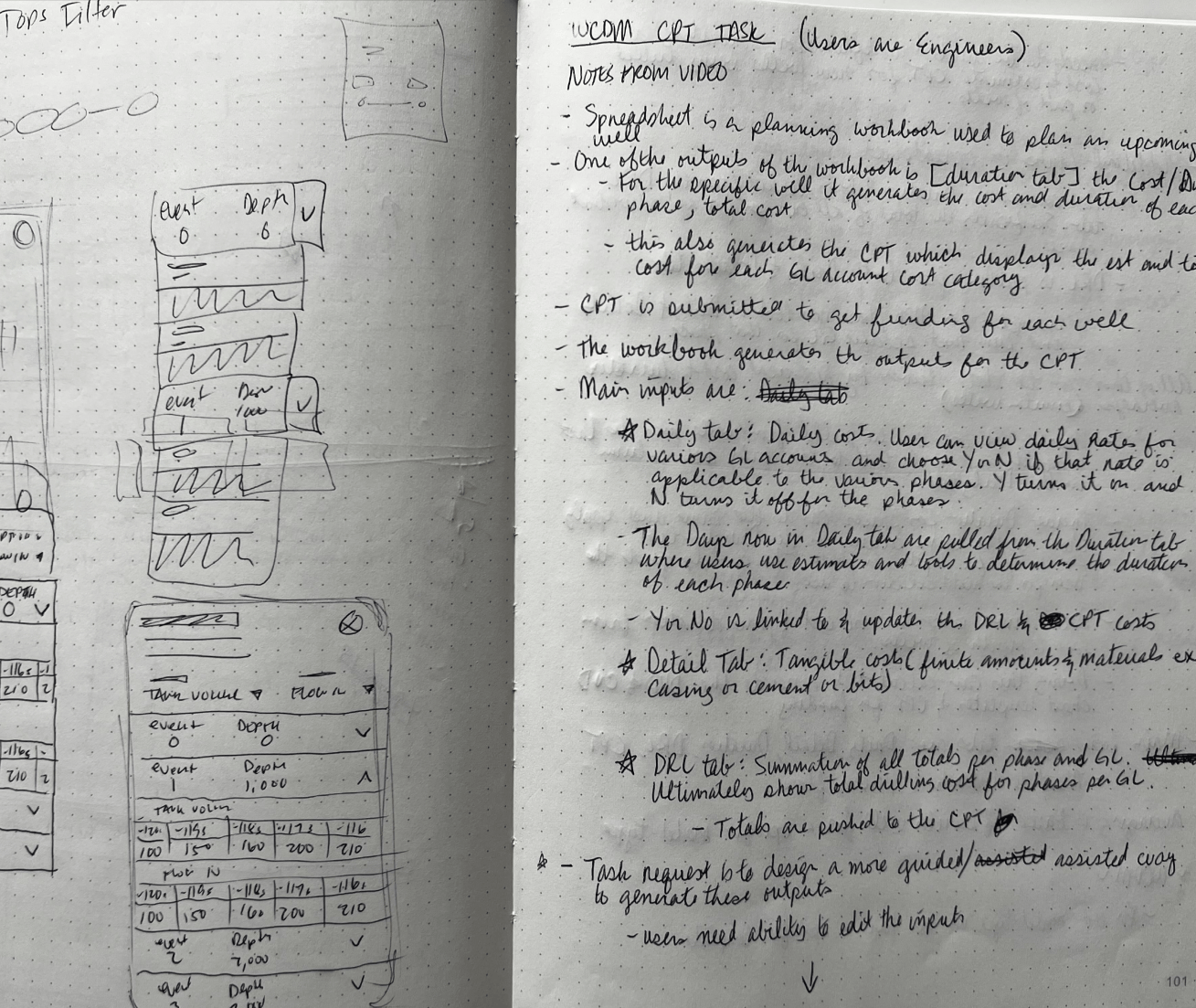
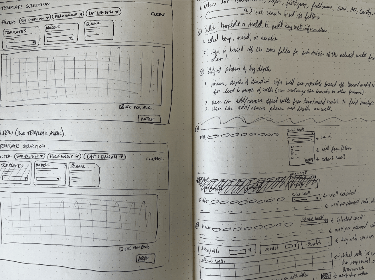
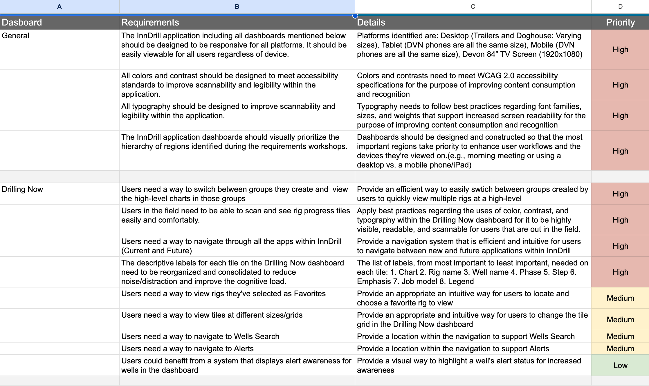
Images of notes, sketches, and requirements
Design Decisions
Two moments where I pushed back and why it mattered.
Designing for enterprise means knowing which battles to fight. These two decisions are examples of where I advocated hard for the right UX solution, made the case to stakeholders, and delivered something better than what was originally asked for.
Decision 01 · Navigation Architecture
The client wanted everything in the top nav. I knew that would fail.
The initial request was to list all tools directly in the main navigation bar. For the tools that existed at the time, it was manageable — but I could see exactly where it was heading. More tools were being planned, and a flat nav would eventually become a cluttered, unusable mess that confused users instead of helping them.
I pushed for a different model: a single "Tools" entry in the main nav that expanded into a dedicated section with a vertical left-side menu. Scalable to any number of tools. Easier to scan. Consistent with patterns users already understood from other enterprise software.
I made the case with a side-by-side comparison — showing what the nav would look like at current scope vs. 6 months from now under both approaches. Stakeholders agreed immediately once they saw it.
Outcome: scalable navigation that grew with the platform — no rework needed
Decision 02 · Performance Scoreboard
Leadership wanted all data visible at once. The result was unreadable.
The scoreboard tracked performance across drillers, partner companies, and rigs — and leadership wanted everything visible simultaneously. In practice, plotting all data points at once produced a chart so dense it was indiscernible at a glance. This was a feature directly tied to performance reviews and personnel decisions. Getting it wrong wasn't just a usability problem.
Rather than overriding their requirements, I designed interactive highlighting — users could isolate specific data points on demand, collapsing the noise around what they were actually reviewing. Leadership got the full dataset they needed. Users got clarity when it mattered.
It was a case of delivering exactly what was asked for — and solving the real problem at the same time.
Outcome: full data fidelity + clarity on demand, no information lost
Design System & Execution
The work no one sees is often the work that matters most.
After 3 years as the sole designer on a platform this complex, the things I'm most proud of aren't visible on any single screen — they're the foundation that made everything else possible: a robust design system, clearly documented user flows, a content hierarchy users could navigate intuitively, and navigation that made the platform feel coherent instead of cobbled together.
- Adapted an existing UI kit to Devon's brand, then extended it significantly with custom components and nested variant structures
- Responsive grids for desktop and field use — with size variants for key components across environments
- Full state coverage on every component: default, hover, active, error, disabled
- Annotated handoff specs for multiple breakpoints with intent documentation — not just dimensions
- UXQA on every dev story — signed off only when implementation matched design intent
- UX-driven backlog stories to keep user intent visible throughout the build, not just at design time
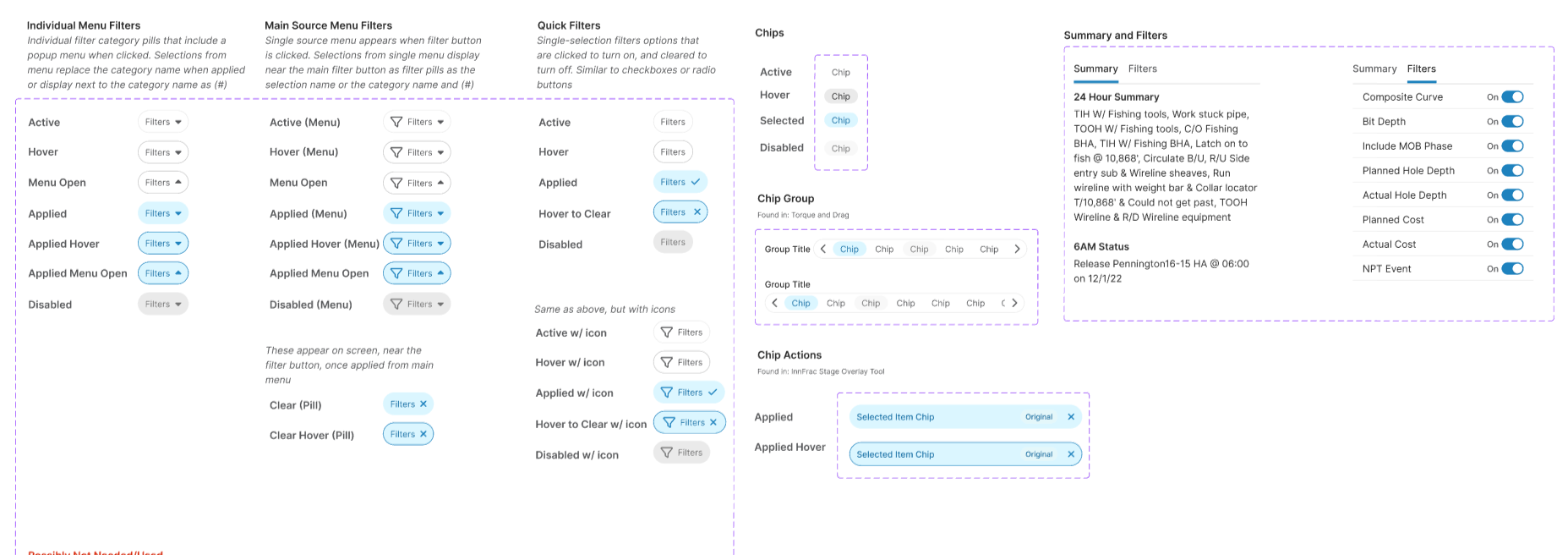
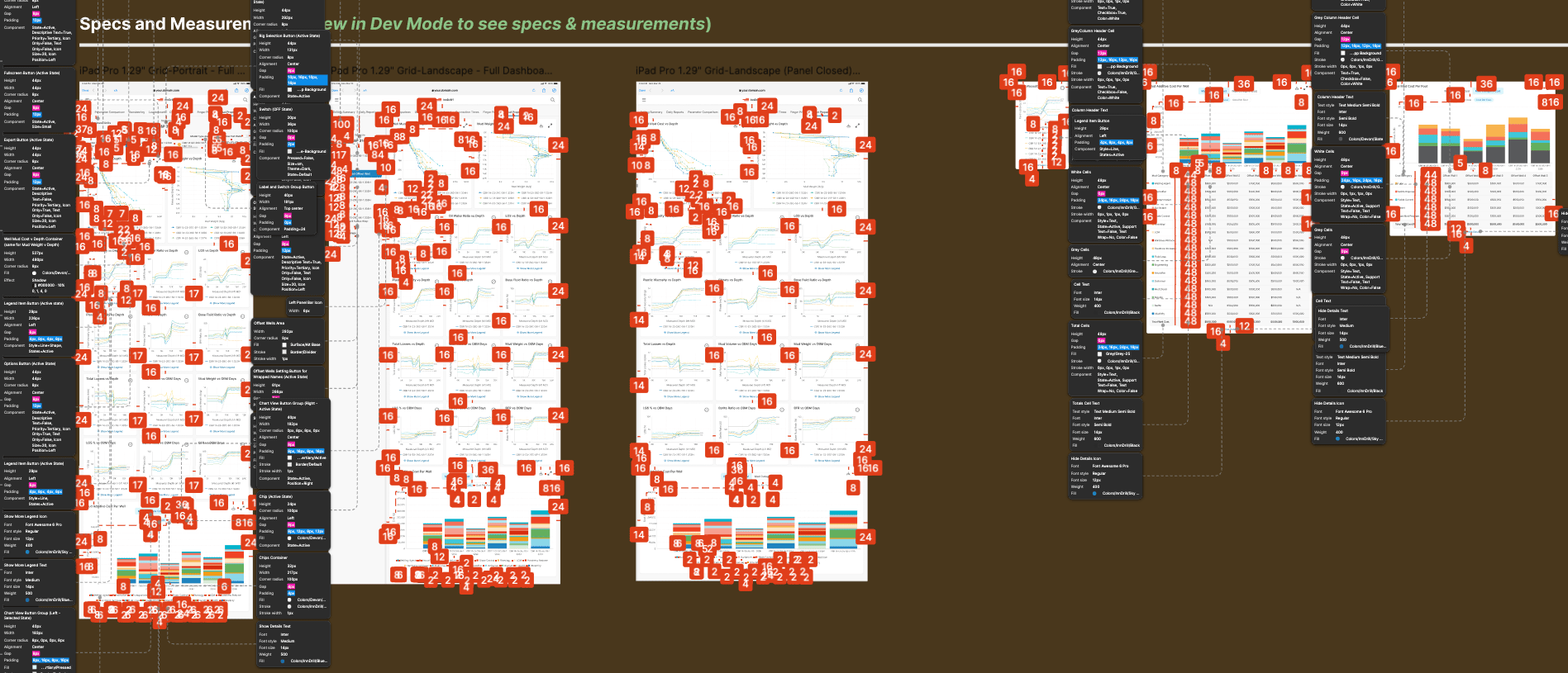
Screenshot sections of design system and a handoff file
Outcomes
What shipped — and what changed because of it.
The platform launched as an MVP and has expanded continuously. Daily adoption was immediate — users were in the product from day one, with Drilling Performance and Drilling Summary becoming anchor screens that drew in new users and kept experienced ones coming back every morning.
The most concrete impact: daily morning operations meetings that previously ran 90 minutes were cut to 45 — because the data teams needed was now visible and navigable in the time it actually took to review it, not retrieve it.
Five tools were consolidated into one. Usability complaints dropped significantly after launch. And three years in, Devon's continued investment in the platform reflects what sustained adoption looks like when the UX is built on real user needs.
“Thanks for your great work. We're really happy with what the team has done with this project.”
Chief Technology Officer, Devon Energy
“This is so much better than what we’re used to using.”
Chief Technology Officer, Devon Energy
“It’s awesome and we enjoy working in ‘Falcon’.”
End User in the Field, Devon Energy
“This is really helpful to us. We didn’t have this kind of structure previously.”
FE DEveloper Devon Energy
“You’re amazing; you’re like magic!”
Product Owner, Devon Energy
Reflection
What I'd do differently.
I’d change
- Start with a denser layout — I overcorrected early toward simplicity when enterprise users actually want information density
- Lock the color palette and spacing system before it sprawled — foundational decisions made late are expensive
- Choose a more scalable icon system from day one, before it was deeply embedded
What I learned
- Enterprise UX is won through patient education and selective pushback — not authority or creativity for its own sake
- Lightweight, opportunistic research still produces real, actionable insight when formal methods aren't available
- The best outcome is sometimes a well-reasoned compromise — knowing which battles to fight is the skill
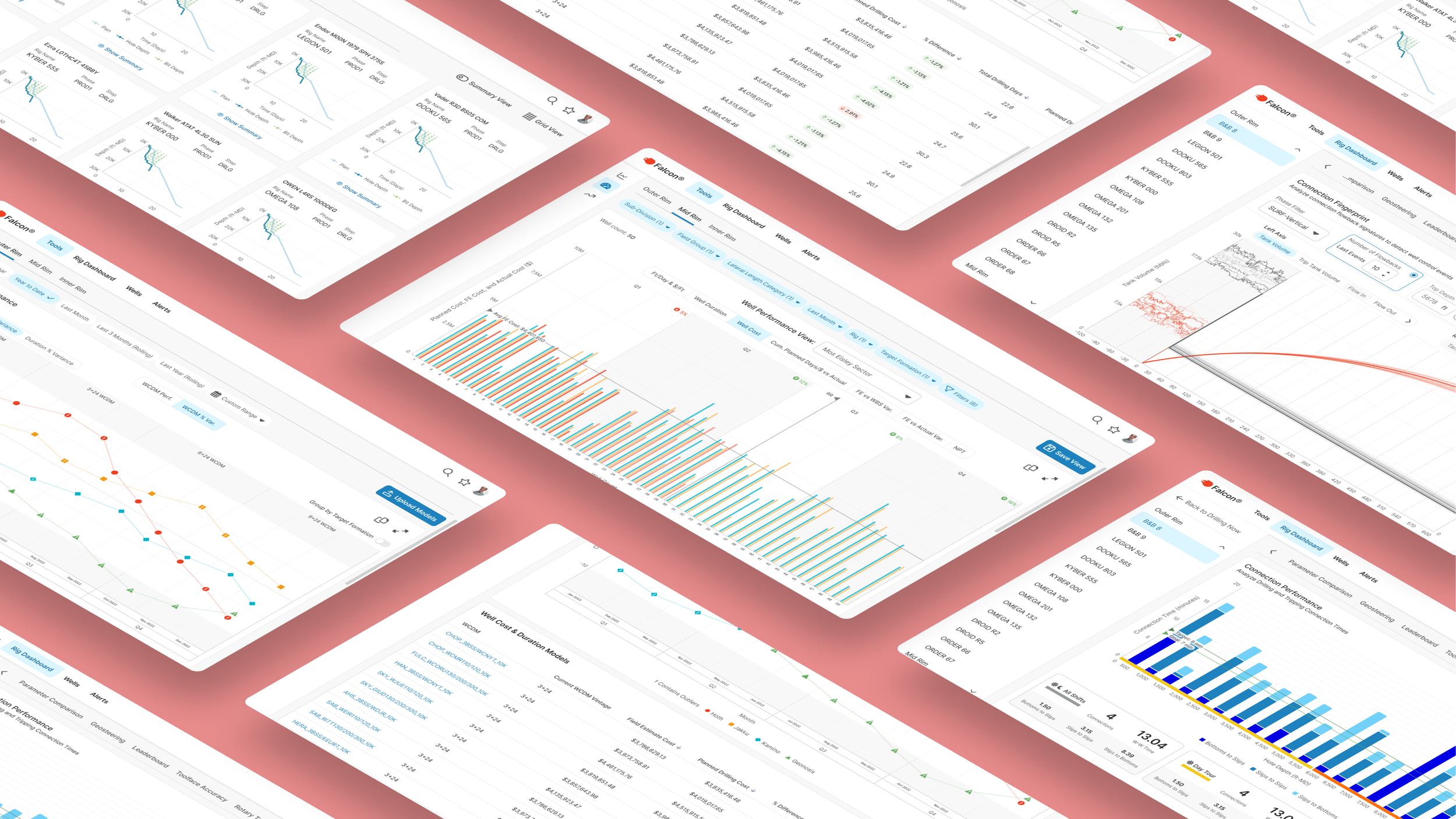
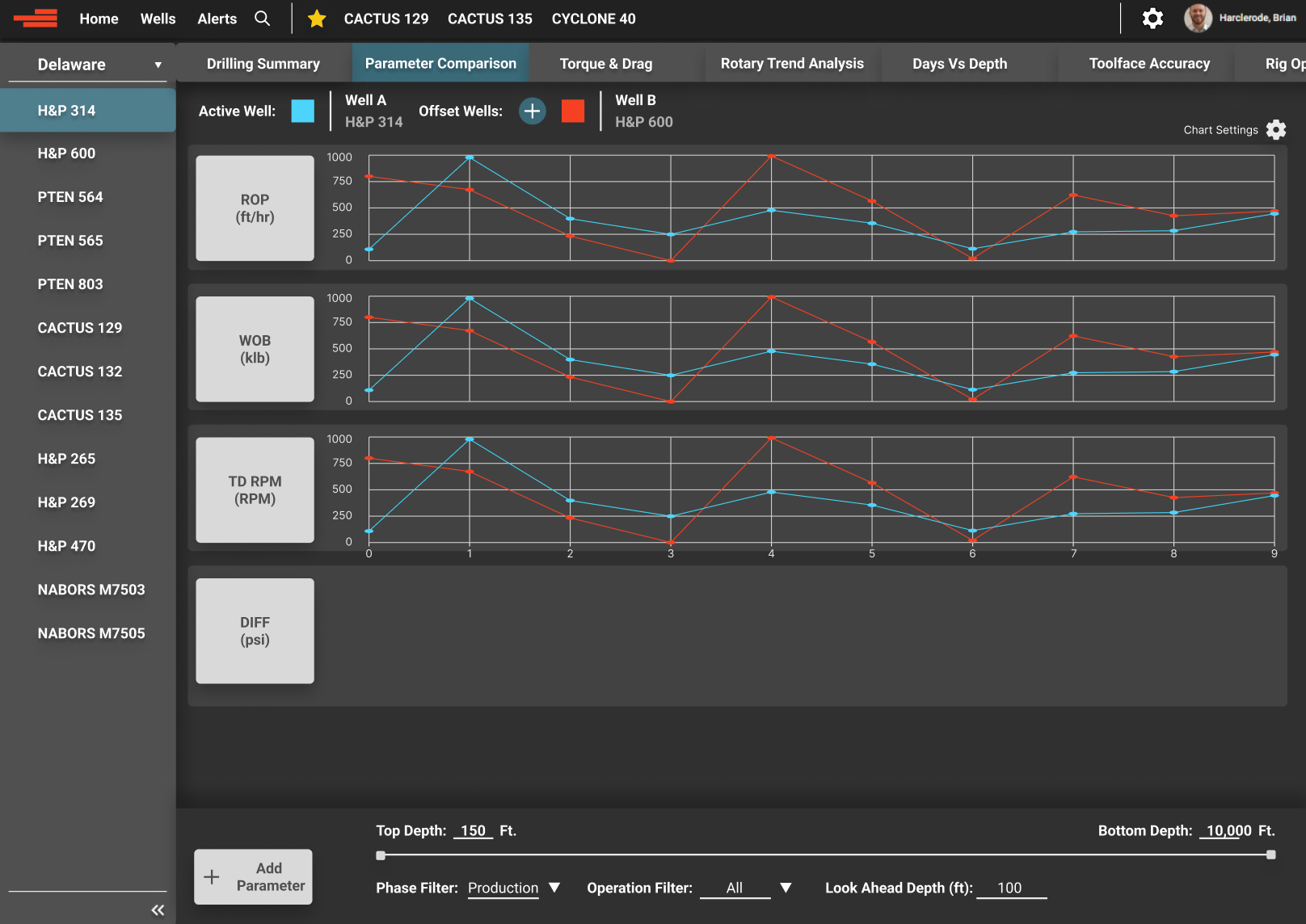
Selected Screens
Desktop | Tablet | Phone
Scroll to Case Study
Case Study | Enterprise UX | Energy Sector | Internal Tool
Falcon: Enterprise Drilling Platform
I was brought in as the first — and only — UX designer on a 3-year project to rebuild a mission-critical internal platform from the ground up. What started as a request to "make it responsive" became a full-scale redesign used daily by engineers, field teams, and executives to make real-time operational decisions.
ROLE
Lead UX Designer (sole designer)
USERS
50–100 daily (engineers, field teams, executives)
DURATION
3 years
Scope
Research, Strategy, Design, Design System, Handoff, UXQA
Real-time drilling life screen for currently active wells featured on various devices
45 min
Daily morning meetings, down from 1.5 hours
5 → 1
Separate tools consolidated into one platform
~15%
Increase in user adoption
Scroll to Project Screens
…or continue reading the case study below
Context
The brief was to make it responsive. The real problem was much bigger.
Devon Energy's internal drilling platform had been built by engineers, for engineers. It was functionally powerful — but usability had never been part of the equation. When I joined, drilling teams were bouncing between five separate tools to get through a single morning. Executives were sitting through 90-minute meetings just to review data that should have been immediately visible. The interface added cognitive load to moments that couldn't afford it.
The ask was "make it responsive." What I found was a system creating friction at every high-stakes moment — in the field, in the meeting room, and everywhere in between.
Before writing a single wireframe, I reframed the problem:
"How do we modernize and consolidate these tools while preserving what users know, improving clarity under pressure, and making critical data immediately visible across every device and environment where this work actually happens?"
Example of project’s previous state
Discovery & Research
I knew nothing about drilling. I had to learn fast and figure out what actually mattered.
Enterprise research is rarely textbook. I had limited access, users with no spare time, and a domain I was starting from zero in. I worked with what I had.
- Stakeholder and user interviews — drilling engineers, field staff, product owners
- Workshops to map mental models and surface hidden workflow dependencies
- Legacy tool audits — understanding what users were accustomed to before designing what came next
- Direct knowledge transfer from a drilling engineer embedded on the team
- On-site observation when access allowed
Three findings shaped everything that followed:
Finding 01
Legacy behavior was a feature, not a bug
Years of muscle memory were baked into old tools. Any redesign that ignored that would fail in adoption regardless of how polished it looked. The solution had to balance modernization with familiarity.
Finding 02
Visual clarity was a usability requirement, not polish
Many users were older with varying visual needs. Contrast, hierarchy, and typography weren't aesthetic choices — they were functional requirements for people scanning high-stakes data under pressure.
Finding 03
Navigation speed had a direct operational cost
Users accessed this tool mid-meeting, mid-call, mid-operation. Every unnecessary click or confusing screen transition had a real cost — in time, in frustration, and in decisions made with incomplete information.
Images of notes, sketches, and requirements
Design Decisions
Two moments where I pushed back and why it mattered.
Designing for enterprise means knowing which battles to fight. These two decisions are examples of where I advocated hard for the right UX solution, made the case to stakeholders, and delivered something better than what was originally asked for.
Decision 01 · Navigation Architecture
The client wanted everything in the top nav. I knew that would fail.
The initial request was to list all tools directly in the main navigation bar. For the tools that existed at the time, it was manageable — but I could see exactly where it was heading. More tools were being planned, and a flat nav would eventually become a cluttered, unusable mess that confused users instead of helping them.
I pushed for a different model: a single "Tools" entry in the main nav that expanded into a dedicated section with a vertical left-side menu. Scalable to any number of tools. Easier to scan. Consistent with patterns users already understood from other enterprise software.
I made the case with a side-by-side comparison — showing what the nav would look like at current scope vs. 6 months from now under both approaches. Stakeholders agreed immediately once they saw it.
Outcome: scalable navigation that grew with the platform — no rework needed
Decision 02 · Performance Scoreboard
Leadership wanted all data visible at once. The result was unreadable.
The scoreboard tracked performance across drillers, partner companies, and rigs — and leadership wanted everything visible simultaneously. In practice, plotting all data points at once produced a chart so dense it was indiscernible at a glance. This was a feature directly tied to performance reviews and personnel decisions. Getting it wrong wasn't just a usability problem.
Rather than overriding their requirements, I designed interactive highlighting — users could isolate specific data points on demand, collapsing the noise around what they were actually reviewing. Leadership got the full dataset they needed. Users got clarity when it mattered.
It was a case of delivering exactly what was asked for — and solving the real problem at the same time.
Outcome: full data fidelity + clarity on demand, no information lost
Design System & Execution
The work no one sees is often the work that matters most.
After 3 years as the sole designer on a platform this complex, the things I'm most proud of aren't visible on any single screen — they're the foundation that made everything else possible: a robust design system, clearly documented user flows, a content hierarchy users could navigate intuitively, and navigation that made the platform feel coherent instead of cobbled together.
- Adapted an existing UI kit to Devon's brand, then extended it significantly with custom components and nested variant structures
- Responsive grids for desktop and field use — with size variants for key components across environments
- Full state coverage on every component: default, hover, active, error, disabled
- Annotated handoff specs for multiple breakpoints with intent documentation — not just dimensions
- UXQA on every dev story — signed off only when implementation matched design intent
- UX-driven backlog stories to keep user intent visible throughout the build, not just at design time
Screenshot sections of design system and a handoff file
Outcomes
What shipped — and what changed because of it.
The platform launched as an MVP and has expanded continuously. Daily adoption was immediate — users were in the product from day one, with Drilling Performance and Drilling Summary becoming anchor screens that drew in new users and kept experienced ones coming back every morning.
The most concrete impact: daily morning operations meetings that previously ran 90 minutes were cut to 45 — because the data teams needed was now visible and navigable in the time it actually took to review it, not retrieve it.
Five tools were consolidated into one. Usability complaints dropped significantly after launch. And three years in, Devon's continued investment in the platform reflects what sustained adoption looks like when the UX is built on real user needs.
“Thanks for your great work. We're really happy with what the team has done with this project.”
Chief Technology Officer, Devon Energy
“This is so much better than what we’re used to using.”
Chief Technology Officer, Devon Energy
“It’s awesome and we enjoy working in ‘Falcon’.”
End User in the Field, Devon Energy
“This is really helpful to us. We didn’t have this kind of structure previously.”
FE DEveloper Devon Energy
“You’re amazing; you’re like magic!”
Product Owner, Devon Energy
Reflection
What I'd do differently.
I’d change
- Start with a denser layout — I overcorrected early toward simplicity when enterprise users actually want information density
- Lock the color palette and spacing system before it sprawled — foundational decisions made late are expensive
- Choose a more scalable icon system from day one, before it was deeply embedded
What I learned
- Enterprise UX is won through patient education and selective pushback — not authority or creativity for its own sake
- Lightweight, opportunistic research still produces real, actionable insight when formal methods aren't available
- The best outcome is sometimes a well-reasoned compromise — knowing which battles to fight is the skill
Selected Screens
Desktop | Tablet | Phone
Scroll to Case Study